Dashboard
brilliance_admin.schema.CategoryDashboard
Dashboard pages display widgets with data from any source.
Subclass CategoryDashboard and implement get_data to return a layout of components.
INFO
Dashboard is a regular category that displays widgets with data from any source. You can create as many dashboards as you need.
CategoryDashboard
from brilliance_admin import schema
from brilliance_admin.schema.dashboard.category_dashboard import (
    DashboardContainer, DashboardData)


class MyDashboard(schema.CategoryDashboard):
    slug = 'dashboard'
    title = 'Dashboard'
    icon = 'mdi-chart-bar-stacked'

    async def get_data(self, data: DashboardData, user) -> DashboardContainer:
        # build and return your layout here
...| Parameter | Description |
|---|---|
slug required | Unique identifier |
title required | Display name in the sidebar |
icon | Material Design icon name (e.g. 'mdi-chart-bar-stacked') Icons Database |
search_enabled | Enable search input on the dashboard page |
search_help | Placeholder text for the search input |
table_filters | FieldsSchema to render filter controls above the dashboard |
DashboardData
| Parameter | Description |
|---|---|
search | Search query string (if search_enabled=True) |
filters | Dict of applied filter values (if table_filters is set) |
Layout
Use DashboardContainer to arrange components in a grid. Containers can be nested.
| Parameter | Description |
|---|---|
cols | Column width (1-12), default 12 |
md | Column width on medium screens |
lg | Column width on large screens |
sm | Column width on small screens |
components | List of child components |
DashboardContainer(
    components=[
        DashboardContainer(
            cols=12, md=6,
            components=[chart_1],
        ),
        DashboardContainer(
            cols=12, md=6,
            components=[chart_2],
        ),
    ],
)
Components
PeriodGraph
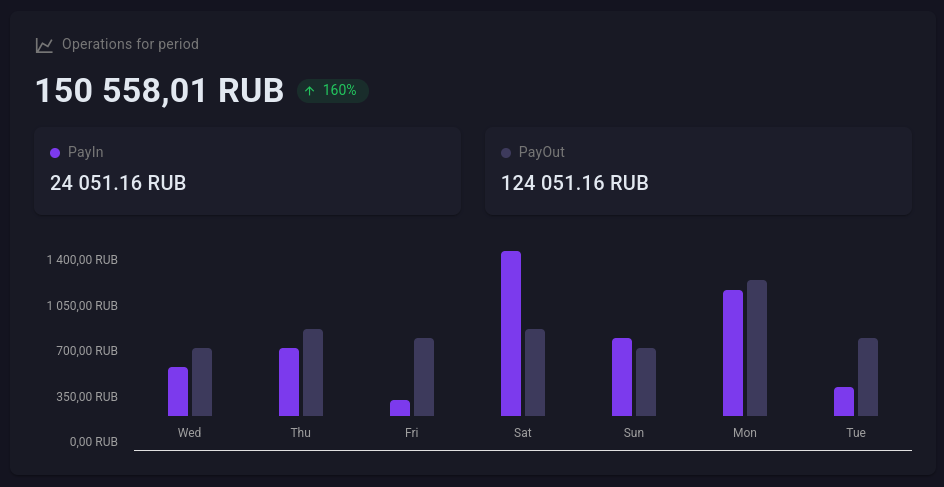
Bar chart with a summary value, change percentage and subcards.
from brilliance_admin.schema.dashboard.category_dashboard import (
    PeriodGraph, Subcard)

period = PeriodGraph(
    title='Operations for period',
    value='150 558,01 RUB',
    change=160,
    subcards=[
        Subcard(title='PayIn', value='24 051 RUB', color='#4CAF50'),
        Subcard(title='PayOut', value='124 051 RUB', color='#1976D2'),
    ],
    horizontal=['Mon', 'Tue', 'Wed', 'Thu', 'Fri'],
    vertical=['1 400', '1 050', '700', '350', '0'],
    values=[
        [25, 35],
        [35, 45],
        [8, 40],
        [85, 45],
        [40, 35],
    ],
)| Parameter | Description |
|---|---|
title | Card title |
value | Main displayed value |
change | Change percentage (positive = green, negative = red) |
subcards | List of Subcard(title, value, color) below the main value |
horizontal | X-axis labels |
vertical | Y-axis labels |
values | List of value arrays per bar group |
SmallGraph
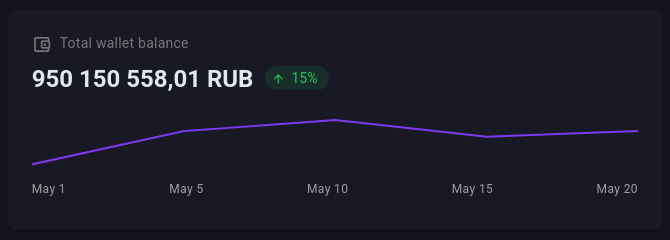
Compact card with a sparkline.
from brilliance_admin.schema.dashboard.category_dashboard import SmallGraph

balance = SmallGraph(
    title='Wallet balance',
    value='950 150 558 RUB',
    change=15,
    points={'01.05': 5, '05.05': 35, '10.05': 45, '15.05': 30},
)| Parameter | Description |
|---|---|
title | Card title |
value | Main displayed value |
change | Change percentage |
points | Dict of {label: value} for the sparkline |
ChartData
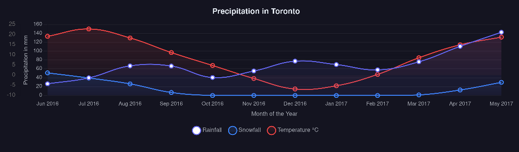
Any ChartJS chart. Pass data and options directly in ChartJS format.
from brilliance_admin.schema.dashboard.category_dashboard import ChartData

chart = ChartData(
    type='line',
    height=300,
    data={
        'labels': ['Jan', 'Feb', 'Mar', 'Apr'],
        'datasets': [{
            'label': 'Revenue',
            'data': [65, 59, 80, 81],
            'borderColor': '#3b82f6',
        }],
    },
    options={
        'responsive': True,
        'plugins': {'legend': {'position': 'top'}},
    },
)| Parameter | Description |
|---|---|
type | ChartJS chart type: 'line', 'bar', 'pie', 'doughnut', etc. |
data | ChartJS data object with labels and datasets |
options | ChartJS options object |
height | Chart height in pixels (default 50) |
width | Chart width in pixels |
TIP
See ChartJS documentation for all available chart types and options.
Full example
https://github.com/brilliance-admin/backend-python/blob/main/example/sections/dashboard.py